Overview
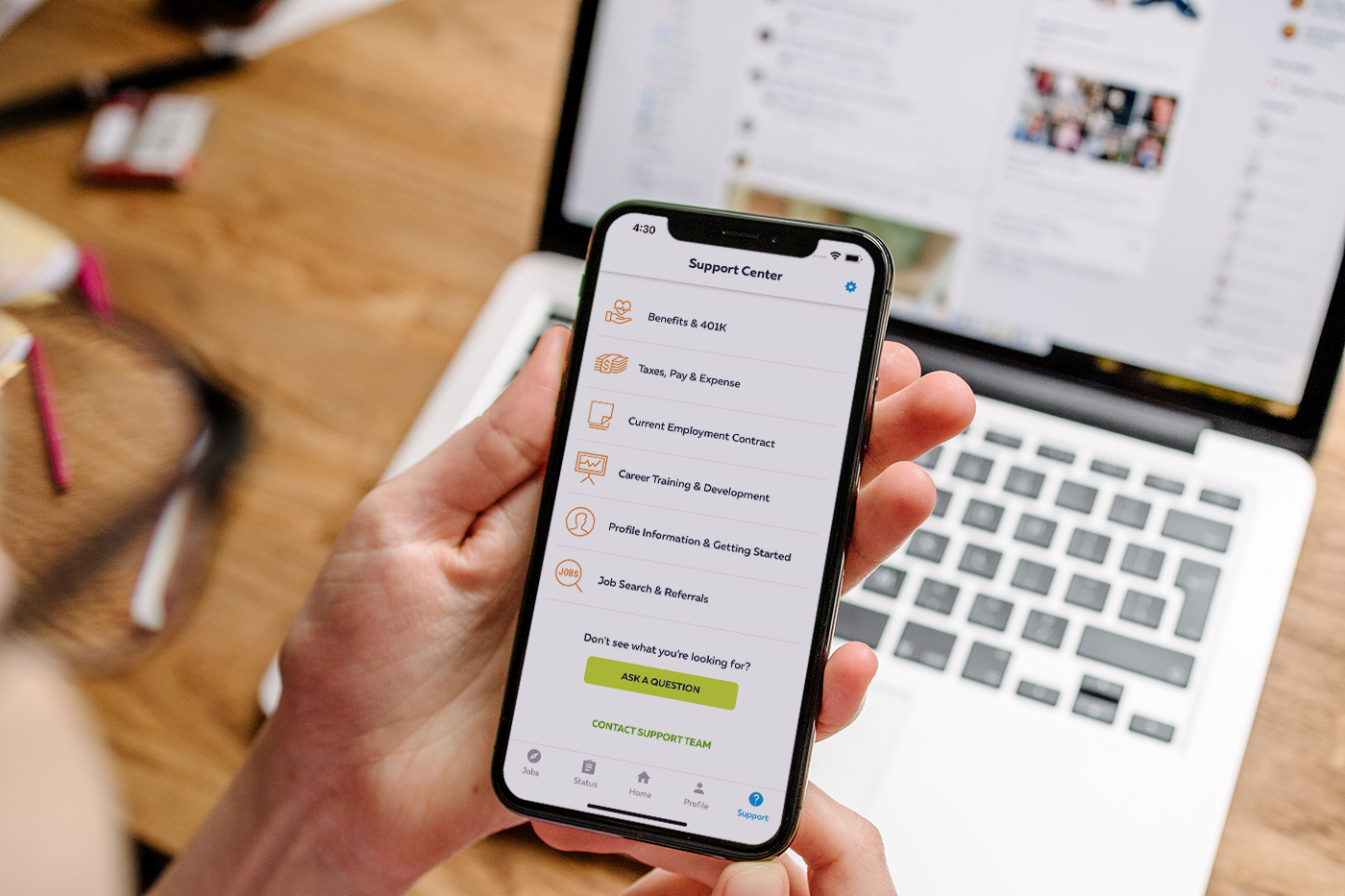
An international talent management firm was operating in a changing and challenging environment with fierce competition entering the market with new technologies and products. Furthermore, customers’ expectations are changing. As a result, they wanted to create a new mobile channel for their network of specialized staffing companies. They needed to increase digital start and offer a better digital tool to improve efficiency and give users more transparency.
Scope & Constraints
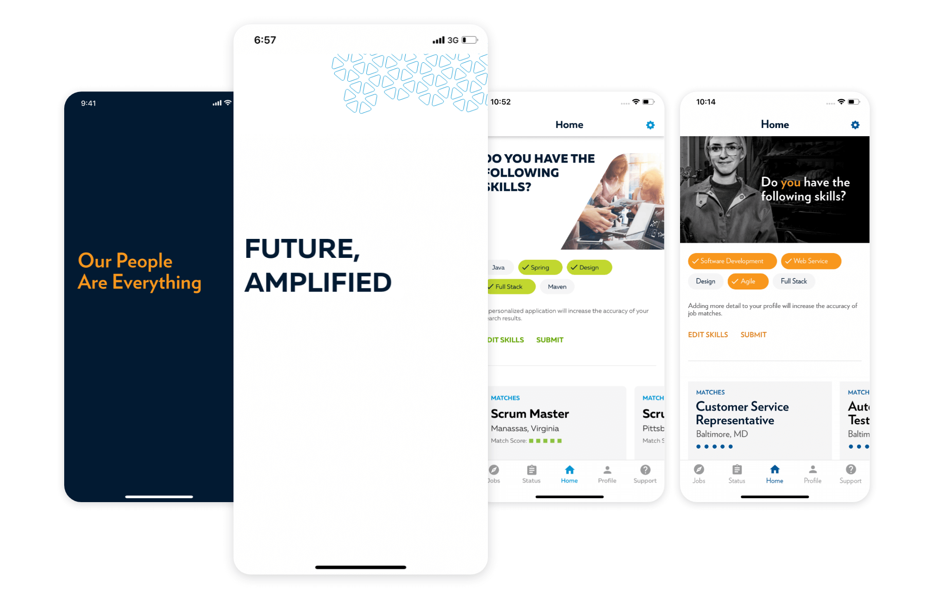
The scope involved developing two mobile apps (Android and iOS) versatile enough to adapt to multiple brands. At the same time, constraints included an 18-month project timeline, a small budget, and the challenges of coordinating a global team spread across the USA, India, and Canada.
MY ROLE
As the Lead UX Designer, I led the initial product discovery phase. Leading the design and experience of the iOS and Android app, my responsibilities included producing all major deliverables and mentoring a junior UX designer. Navigating time zone differences, we ensured a cohesive design process.
Key Contributions
• Teamed with a business analyst, we conducted product discovery workshops, field studies, expert and user interviews
• Created artifacts such as personas, user flows, user research reports, competitive analysis, and post-launch analysis documentation
• Created wireframes and prototypes
• Validated prototypes through user testing
• Led mid-sprint design reviews with stakeholders
• Developed a comprehensive design system and high-fidelity design mockups
• User-tested additional functionality
MY PROCESS

The five steps of Design Thinking: an iterative journey
Users
The application targeted three distinct personas – job seekers, current contractors, and former contractors. Each persona had unique goals and pain points, requiring a tailored approach to meet their unique needs and enhance their overall user experience. Interestingly, a shared pain point among all personas was the perception of missing vital information, resulting in a feeling of being lost in the process. This commonality underscored the crucial need for enhanced transparency within the application to address users' concerns effectively.
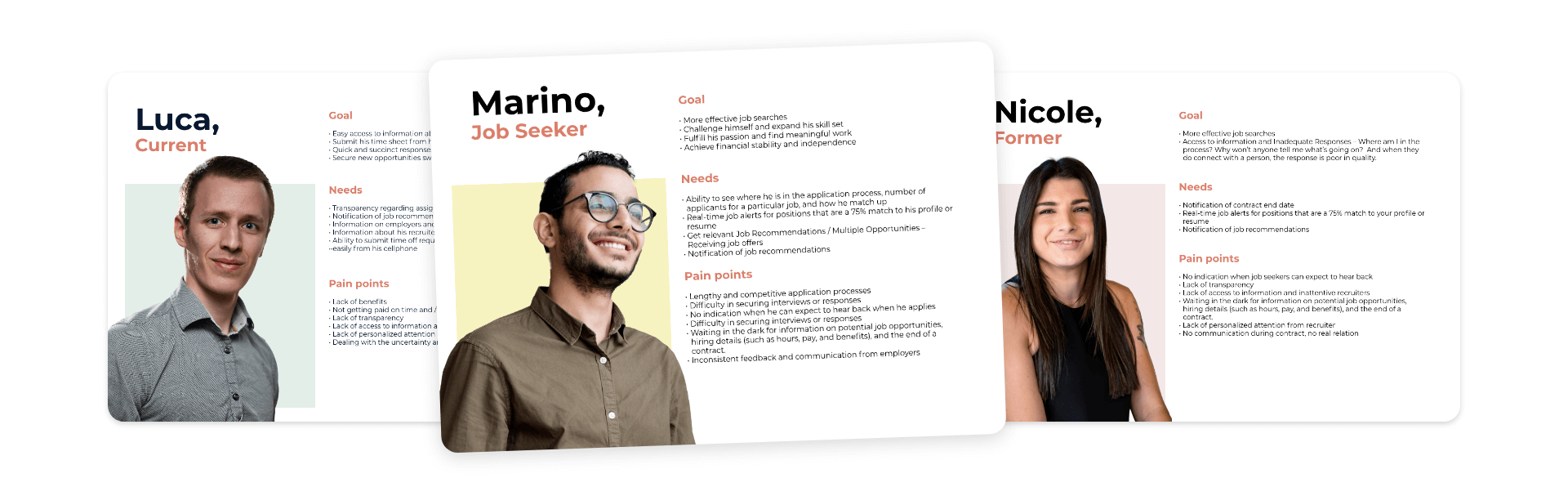
The three personas identified
activities
To kickstart the project, we held collaborative workshops to define the problem statement and align business goals and user needs. These sessions provided a crucial platform for cross-functional teams to collaborate, share insights, and establish a shared vision.
During these initial stages, we closely collaborated with stakeholders laying the foundation for the project. Utilizing existing research and documentation, we conducted a comprehensive analysis of their current web platform, identifying its strengths and weaknesses. This analysis informed our approach as we seamlessly transitioned into the design phase.
Prototyping & Initial User Testing
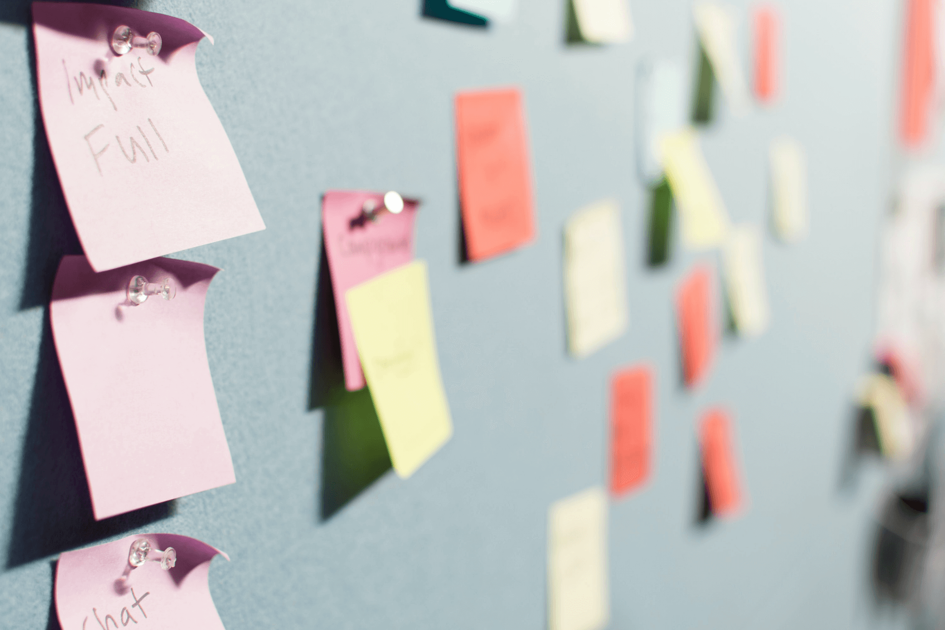
During the early prototype stage, we encountered challenges when the first round of user testing revealed low task completion rates. Recognizing the need for a strategic reassessment, we revisited the Information Architecture. Engaging in card sorting and tree testing activities, we sought to refine navigation and address the root causes of the issues uncovered in user testing.
It became apparent that there was a significant gap between the language of the app and that of the users. This realization prompted a comprehensive review of labeling and navigation. Through surveys, card sorting exercises, and additional tree testing with actual users, we adjusted the app's language and navigation to align more closely with the users' mental models.
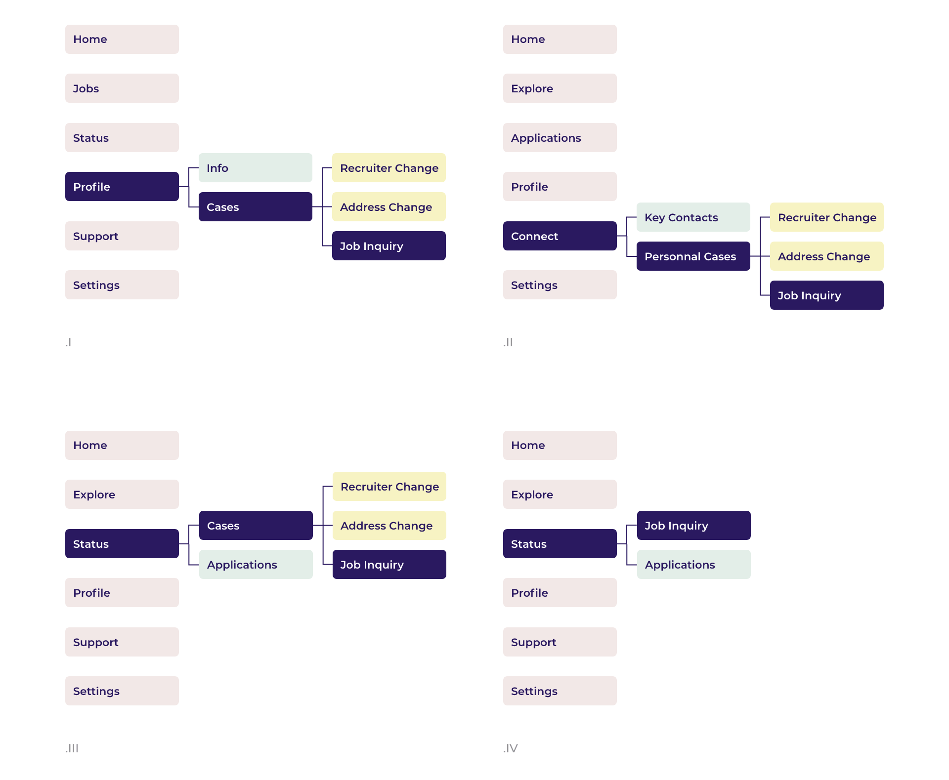
Assessing different navigation options through tree testing to enhance user experience
Design System & Second round of testing
The second round of user testing demonstrated a substantial improvement in task completion rates, validating the effectiveness of the revised Information Architecture. This iterative process allowed us to fine-tune the app's structure based on user feedback, ensuring that the final design was both intuitive and user-friendly.
Simultaneously, we developed a comprehensive design system to maintain consistency across the app and created high-fidelity design mockups tailored for both iOS and Android platforms. This approach enabled us to visualize the user interface in its final form and provided stakeholders with a tangible representation of the proposed design direction.
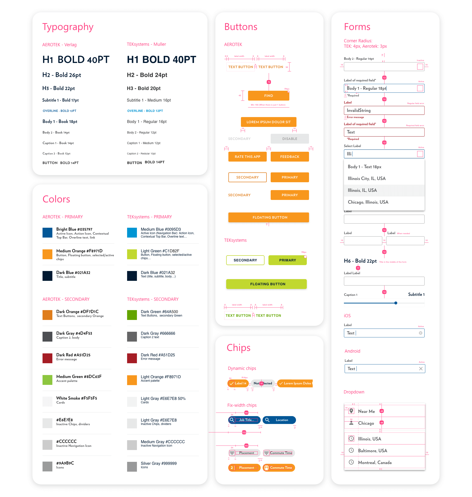
A peek into the design system built to ensure a seamless and consistent experience across brands and operating systems
To reduce build time and create a customizable product for their different brands, we made a collection of reusable components. To ease the deployment for both iOS and Android, we used native components paired with some customized Material Design Components.
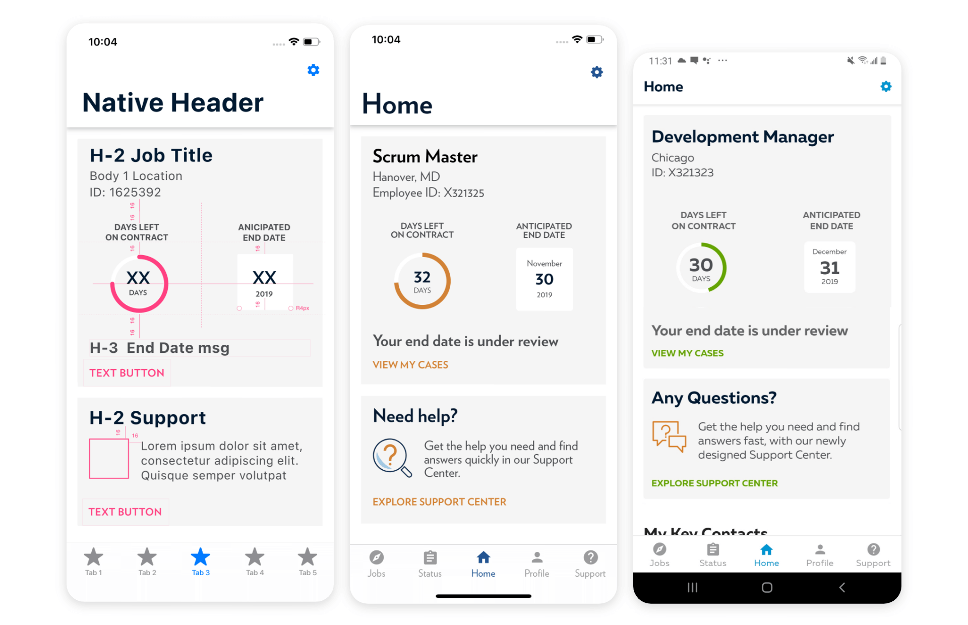
Throughout this process, stakeholder engagement remained crucial. Mid-sprint reviews became a pivotal checkpoint for gaining stakeholder approval, ensuring alignment with project objectives. By integrating user feedback into each design iteration, we fostered a collaborative approach that prioritized both business goals and user needs.
In summary, our approach involved a continuous cycle of testing, iteration, and refinement, with a keen focus on aligning the app's language and structure with the users' expectations. This iterative design process, coupled with the development of a robust design system, allowed us to deliver an engaging and user-centric mobile application that addressed the unique challenges presented by the client's diverse user base.
Outcomes
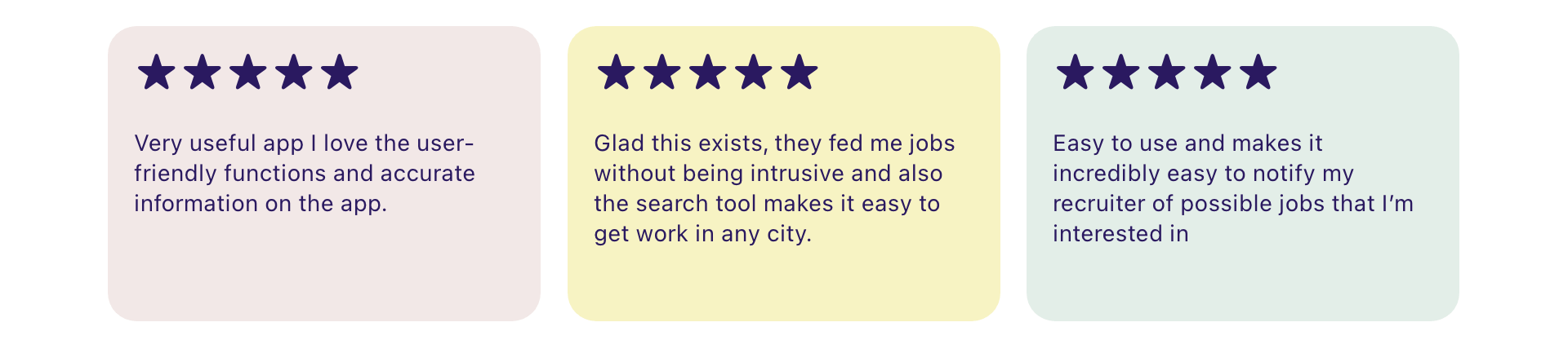
Key metrics, including user engagement and task completion rates, demonstrated significant improvement. The apps garnered impressive scores of 4.7 and 4.8 on app stores, indicating high user satisfaction. Notably, the most clicked items on the app were related to reasons users typically contacted support, indicating a reduction in support calls and improved operational efficiency.
However, challenges remained in seamlessly integrating with third-party platforms due to technical constraints. The introduction of an in-app browser improved the experience but left room for further enhancement.
Lessons Learned
The project highlighted the importance of validating hypotheses with users early in the process. While the team was dedicated to user-centric design, insights gathered during the discovery phase with stakeholders were found to be biased. It serves as a reminder that assumptions about users' understanding of words or concepts may not align. Moving forward, early validation with users will be prioritized to ensure a more unbiased and user-driven design approach.